Get in touch
Morsø Kommune
Morsø Kommune
The taste of The Limfjord
The taste of The Limfjord
The taste of The Limfjord
The taste of The Limfjord







Information
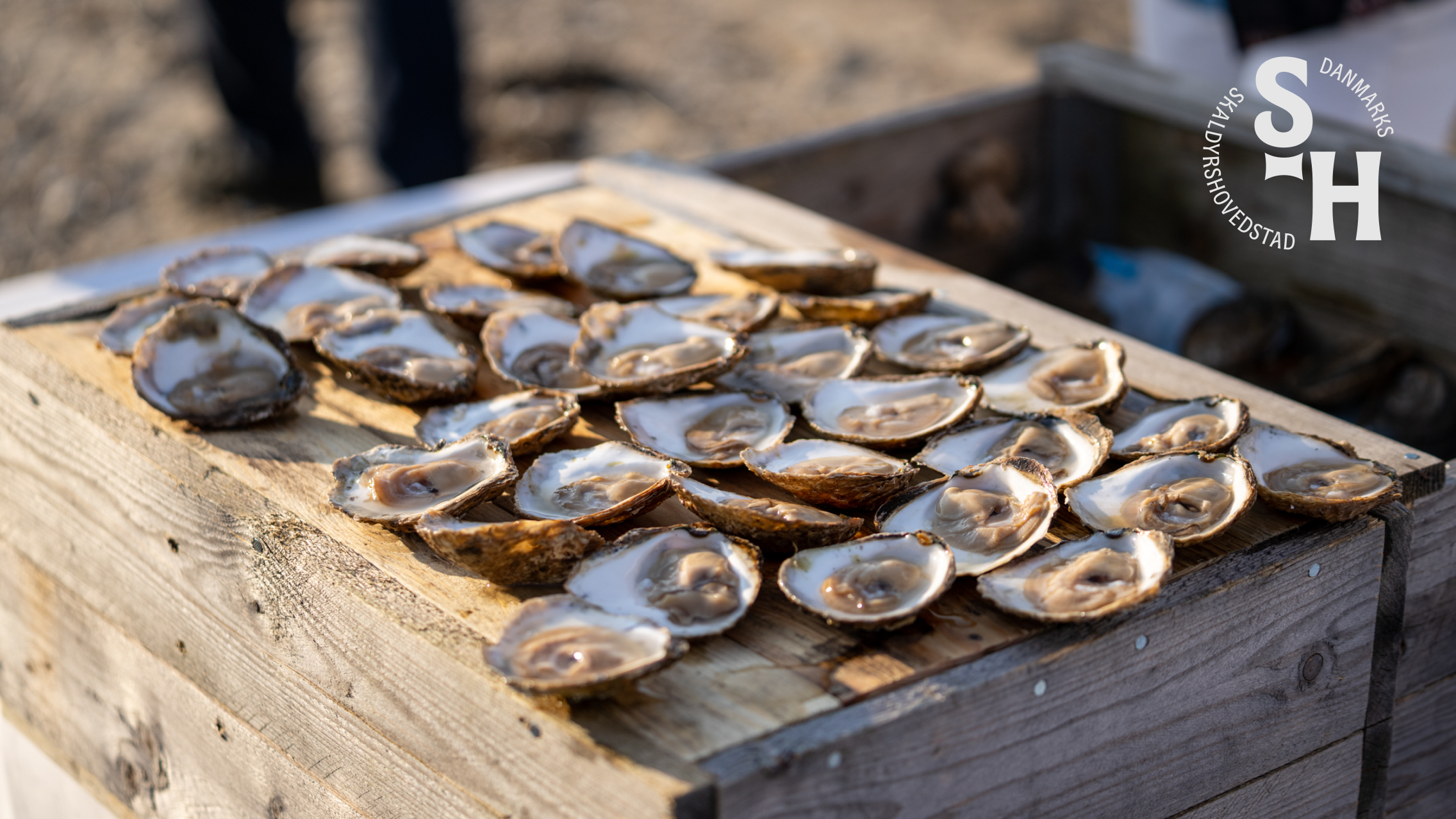
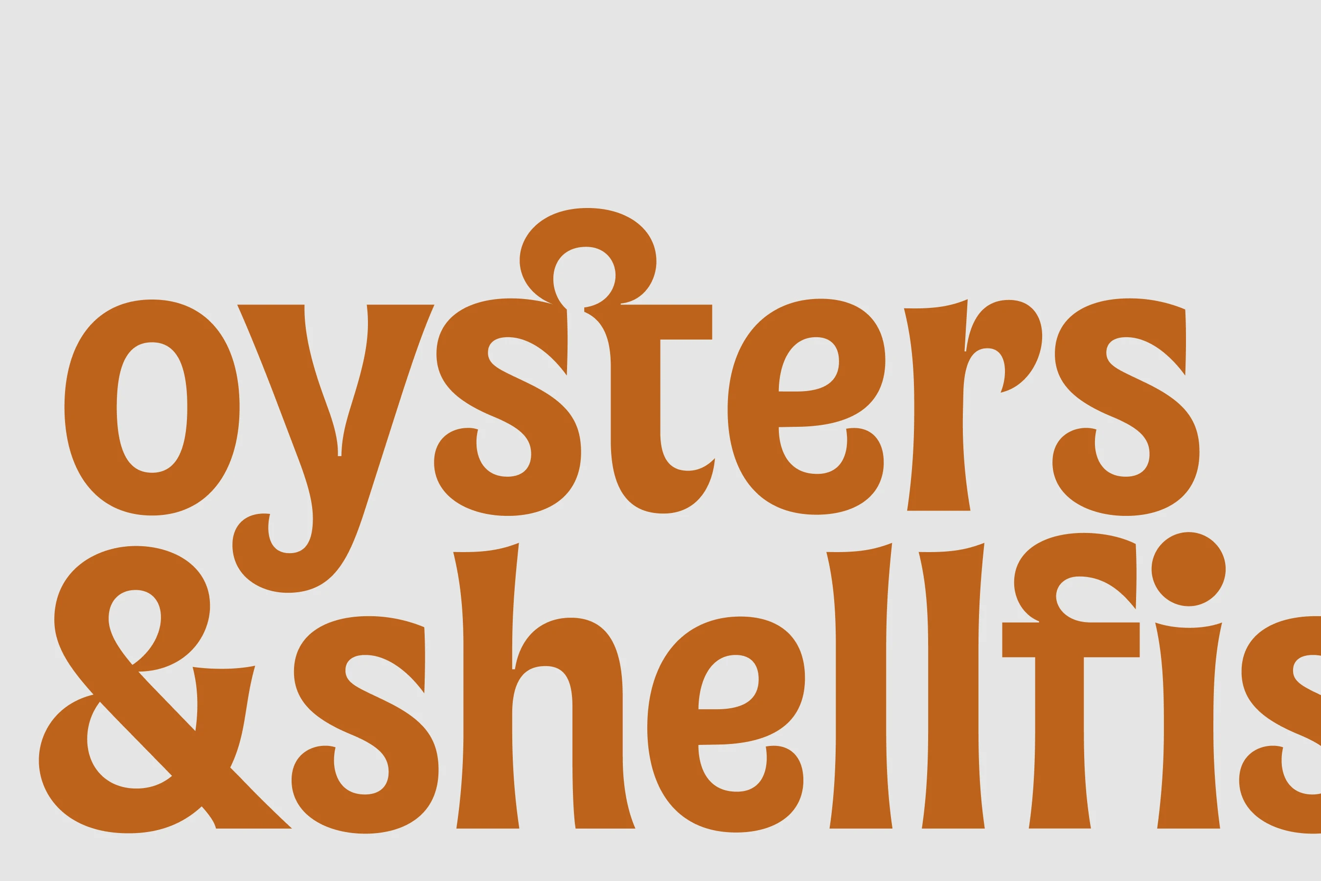
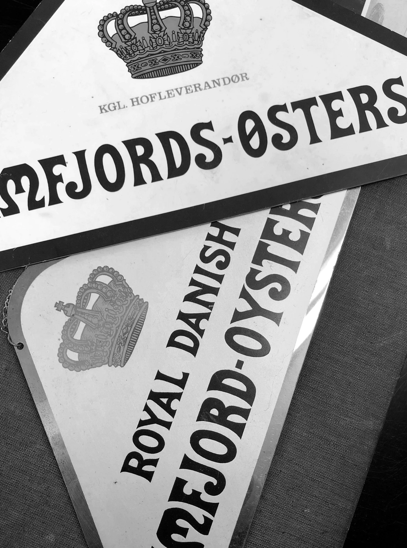
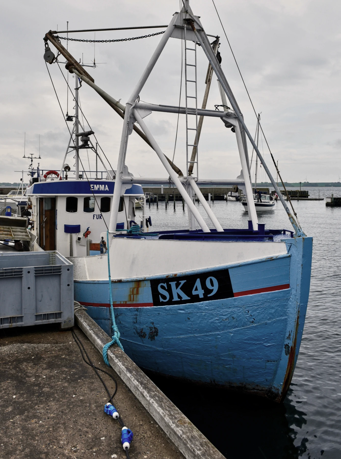
The Limfjord is home to some of Europe’s finest shellfish. Around them, Mors had developed a growing ecosystem of fishermen, producers, restaurants, events and experiences. But while they shared the same local resource, they lacked a common identity that could connect their efforts and make the area more visible as a destination. Morsø Kommune wanted to bring these activities together around a shared position — strengthening collaboration between local actors while building greater awareness of the area nationally and internationally. Together, we created Skaldyrskysterne: a brand rooted in something already distinctive to the place. We developed the brand strategy and visual identity as one connected system, spanning custom typography, digital design, motion, signage and wayfinding. The visual language grows directly from its surroundings. The custom typeface draws on the shapes of shellfish and the fjord, as well as the historic logotype of Limfjords-Østers-Kompagniet — connecting a contemporary destination with a long local tradition. The result is more than a destination identity. It is a shared platform that gives local actors something to gather around — turning a distinctive local resource into a stronger collective presence.
The Limfjord is home to some of Europe’s finest shellfish. Around them, Mors had developed a growing ecosystem of fishermen, producers, restaurants, events and experiences. But while they shared the same local resource, they lacked a common identity that could connect their efforts and make the area more visible as a destination. Morsø Kommune wanted to bring these activities together around a shared position — strengthening collaboration between local actors while building greater awareness of the area nationally and internationally. Together, we created Skaldyrskysterne: a brand rooted in something already distinctive to the place. We developed the brand strategy and visual identity as one connected system, spanning custom typography, digital design, motion, signage and wayfinding. The visual language grows directly from its surroundings. The custom typeface draws on the shapes of shellfish and the fjord, as well as the historic logotype of Limfjords-Østers-Kompagniet — connecting a contemporary destination with a long local tradition. The result is more than a destination identity. It is a shared platform that gives local actors something to gather around — turning a distinctive local resource into a stronger collective presence.
Services
Credits
Web Development: Set Snail
Website
Overtone®
We design identities, websites & type.
Personal. Precise. Intentional.
Copyright 2026 Overtone®
VAT No. 31495431
Aarhus, Denmark
08:20:50 CEST
Overtone®
We design identities, websites & type.
Personal. Precise. Intentional.
Copyright 2026 Overtone®
VAT No. 31495431
Aarhus, Denmark
08:20:50 CEST
Overtone®
We design identities, websites & type.
Personal. Precise. Intentional.
Copyright 2026 Overtone®
VAT No. 31495431
Aarhus, Denmark
08:20:50 CEST
Overtone®
We design identities, websites & type.
Personal. Precise. Intentional.
Copyright 2026 Overtone®
VAT No. 31495431
Aarhus, Denmark
08:20:50 CEST
Overtone®
We design identities, websites & type.
Personal. Precise. Intentional.
Copyright 2026 Overtone®
VAT No. 31495431
Aarhus, Denmark
08:20:50 CEST
Turning a ten-year vision into everyday decisions
aros
From dated expression to distinct presence
1-1-landskab
History in the present
den-gamle-by
Complexity made intuitive
scalgo
A new vision for eye care
copenhagen-eye-institute
Rooted in the past, designed for the present
christiansborg-palace
Making an emerging technology tangible
zero-entropy
A presence before the doors open
kunsthal-spritten
One identity. Many voices.
dr
The taste of The Limfjord
morsø-kommune
Making space for every kind of experience
musikhuset-aarhus