Get in touch
ARoS
ARoS
Turning a ten-year vision into everyday decisions
Turning a ten-year vision into everyday decisions
Turning a ten-year vision into everyday decisions
Turning a ten-year vision into everyday decisions




Information
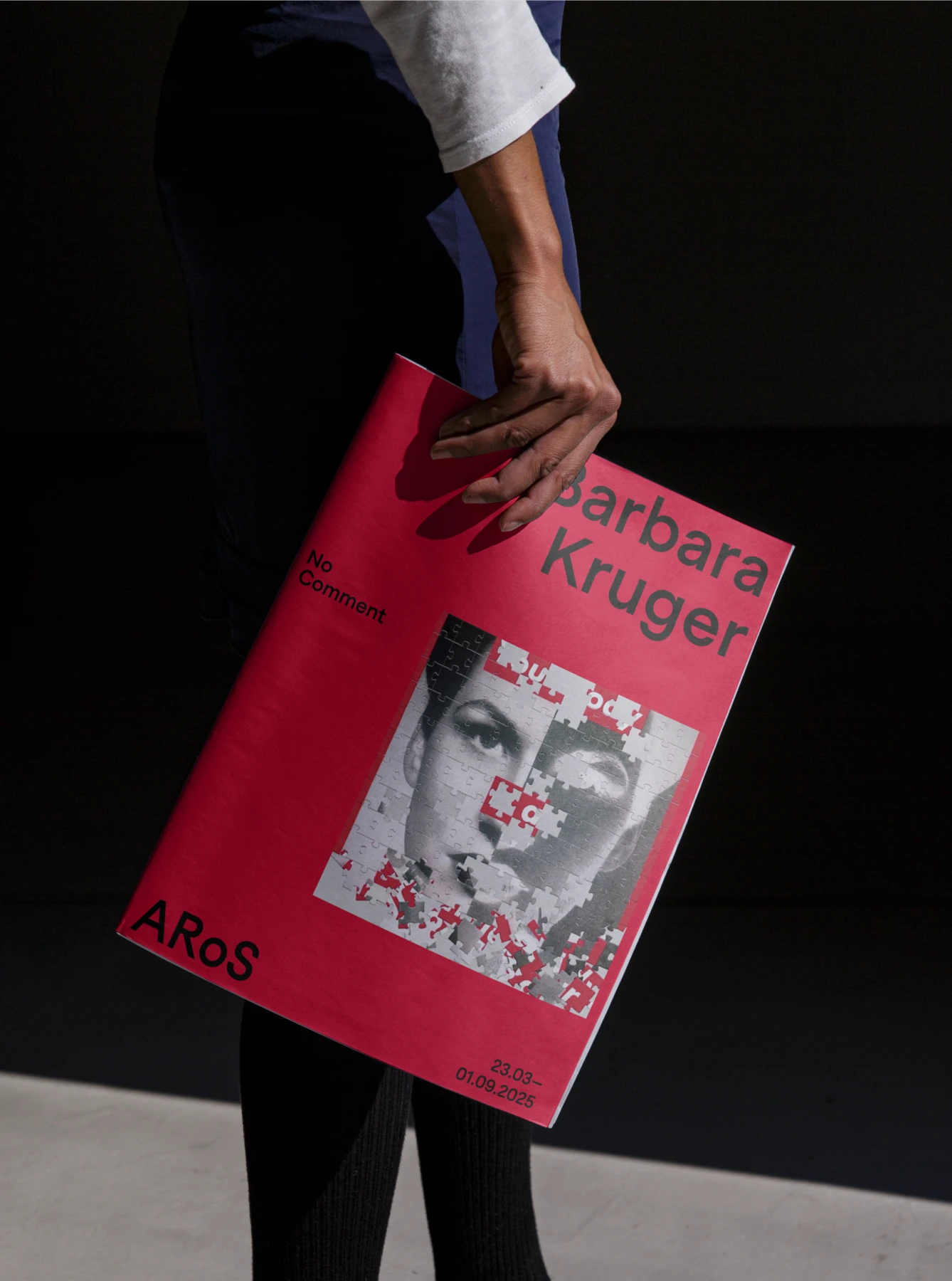
ARoS had set an ambitious direction for the next ten years: to strengthen its international position while becoming even more relevant to the city and people around it. But over time, its brand had grown fragmented. Communication was often dense, the visual identity had accumulated layers, and short-term needs made it difficult to maintain a clear direction. Working closely with ARoS, we turned the vision into a clear position: an international art museum rooted in Aarhus. From there, we developed the brand strategy, tone of voice and visual identity as one connected system. We made the language more direct and accessible and reduced the visual identity to fewer, stronger elements — creating a clearer balance between ARoS as sender and the art it presents. The identity includes a refined wordmark, the custom typeface ARoS Sans, a new typographic system, colour, layout principles and a framework for digital and physical communication. The result is not simply a new expression, but a clearer foundation for everyday decisions. A system that helps teams across ARoS communicate with greater clarity and consistency, while remaining flexible enough to give exhibitions, artists and changing contexts their own space.
ARoS had set an ambitious direction for the next ten years: to strengthen its international position while becoming even more relevant to the city and people around it. But over time, its brand had grown fragmented. Communication was often dense, the visual identity had accumulated layers, and short-term needs made it difficult to maintain a clear direction. Working closely with ARoS, we turned the vision into a clear position: an international art museum rooted in Aarhus. From there, we developed the brand strategy, tone of voice and visual identity as one connected system. We made the language more direct and accessible and reduced the visual identity to fewer, stronger elements — creating a clearer balance between ARoS as sender and the art it presents. The identity includes a refined wordmark, the custom typeface ARoS Sans, a new typographic system, colour, layout principles and a framework for digital and physical communication. The result is not simply a new expression, but a clearer foundation for everyday decisions. A system that helps teams across ARoS communicate with greater clarity and consistency, while remaining flexible enough to give exhibitions, artists and changing contexts their own space.
Services
Brand Strategy Visual Identity Brand Typeface
Credits
Brand strategy: Rasmus Thomsen
Overtone®
We design identities, websites & type.
Personal. Precise. Intentional.
Copyright 2026 Overtone®
VAT No. 31495431
Aarhus, Denmark
08:20:50 CEST
Overtone®
We design identities, websites & type.
Personal. Precise. Intentional.
Copyright 2026 Overtone®
VAT No. 31495431
Aarhus, Denmark
08:20:50 CEST
Overtone®
We design identities, websites & type.
Personal. Precise. Intentional.
Copyright 2026 Overtone®
VAT No. 31495431
Aarhus, Denmark
08:20:50 CEST
Overtone®
We design identities, websites & type.
Personal. Precise. Intentional.
Copyright 2026 Overtone®
VAT No. 31495431
Aarhus, Denmark
08:20:50 CEST
Overtone®
We design identities, websites & type.
Personal. Precise. Intentional.
Copyright 2026 Overtone®
VAT No. 31495431
Aarhus, Denmark
08:20:50 CEST
Turning a ten-year vision into everyday decisions
aros
From dated expression to distinct presence
1-1-landskab
History in the present
den-gamle-by
Complexity made intuitive
scalgo
A new vision for eye care
copenhagen-eye-institute
Rooted in the past, designed for the present
christiansborg-palace
Making an emerging technology tangible
zero-entropy
A presence before the doors open
kunsthal-spritten
One identity. Many voices.
dr
The taste of The Limfjord
morsø-kommune
Making space for every kind of experience
musikhuset-aarhus